Upload presentasi
Presentasi sedang didownload. Silahkan tunggu

1
MASTERING 7 QC TOOLS FOR IMPROVEMENT
TRAINING – TOTAL QUALITY MANAGEMENT SCOPE MASTERING 7 QC TOOLS FOR IMPROVEMENT

2
SASARAN Sasaran Pelatihan Setelah mengikuti pelatihan ini, diharapkan
peserta: Memahami konsep Quality Control Memahami teknik statistik dasar 7 QC tools Mampu mengidentifikasi teknik statistik 7 QC tools yang sesuai untuk menganalisa data di perusahaan dan melakukan improvement

3
Quality Quality …. menurut Customer!! Definition
Fitness for use .... (J. M. Juran) Conformance to Customer Requirements …. (P. Crosby) Meeting Customer Expectations …. (A. V. Feigenbaum) Customer Satisfaction …. (K. Ishikawa) Quality …. menurut Customer!!
 Conformance to Customer Requirements …. (P. Crosby) Meeting Customer Expectations …. (A. V. Feigenbaum) Customer Satisfaction …. (K. Ishikawa) Quality …. menurut Customer!!")
4
Quality Control

5
Quality Control Definition: Quality Control adalah proses inspeksi keseluruhan proses untuk menjamin stabilitas dan mencegah penyimpangan dengan cara mengevaluasi kinerja dan membandingkan dengan sasarannya serta mengambil tindakan jika terjadi penyimpangan Quality Control is universal managerial process for conducting so as to provide stability to prevent adverse change and to change and to ‘maintain the status quo’, by evaluating actual performance, compare actual performance to goals, and take action on the difference (Juran)
")
6
7 QC TOOLS Stratifikasi Lembar Data Grafik Diagram Pareto Histogram
Diagram Ishikawa Diagram Tebar

7
1. STRATIFICATION

8
STRATIFIKASI Definisi: Adalah mengelompokkan/ menggolongkan/ menstratifikasikan data berdasarkan faktor tertentu untuk analisa yang lebih rinci Contoh: Faktor Stratifikasi Umum Mengelompokkan data berdasarkan …. Siapa: Departemen, individu, jenis pelanggan Apa: Jenis komplain, kategori cacat, alasan menelepon Kapan: bulanan, triwulan, hari, waktu Dimana: bagian, kota, lokasi spesifik dari produk (sudut kanan atas, tombol on/off, dsb)
")
9
STRATIFIKASI (ANALISIS DATA) Contoh
Kesimpulan: Mesin dari line C yang menghasilkan unit ditolak terbesar (75 unit)
")
10
EXAMPLE : STRATIFICATION
WITHOUT STRATIFICATION WITH STRATIFICATION Reviewing the two figures above, what is your Conclusion?

11
Agriculture Dept. Announcement)
How to identify a mad cow disease Normal with mad cow disease Double click on sound button ©2003 QA Publishing, LLC By Paul A. Keller 1

12
STRATIFIKASI Manfaat: Untuk mengumpulkan informasi mengenai pola dan penyebab masalah

13
Kasus Perusahaan Televisi
Sub Woofer Sub Woofer TV-A TV-B TV-C Sebuah perusahan TV merek SONYA mempunyai 4 buah pabrik. Setiap pabrik memiliki 4 line produksi dengan kapasitas produksi 1000 unit per hari, memproduksi tiada henti 3 jenis design TV dan berbagai ukuran TV dari kecil s/d besar, dengan jumlah pekerja 3000 karyawan. Beberapa Mitra kerja (Supplier) ikut berperan dalam supplai material. Suatu ketika, di bulan November 1994, ada 2400 customer complain tentang gambarnya yang berbintik-bintik. Dan terpaksa semua TV berbagai Inch ditarik dari pasaran. Kira-kira bagaimana anda mengamati? Apa potensi data yang bisa di Stratifikasi? Diskusikan dengan tim anda.
 ikut berperan dalam supplai material. Suatu ketika, di bulan November 1994, ada 2400 customer complain tentang gambarnya yang berbintik-bintik. Dan terpaksa semua TV berbagai Inch ditarik dari pasaran. Kira-kira bagaimana anda mengamati Apa potensi data yang bisa di Stratifikasi Diskusikan dengan tim anda.")
14
Kasus Perkebunan Teh Pada tahun 1998, Salah satu grup Mustika Ratu bagian Perkebunan Teh, yg daerah kebunnya seluas 20 ribu Ha pada berbagai tempat, menghadapi masalah serius. Produksi teh, turun drastis pada posisi 20% dari target 80%. Dipastikan jika masalah ini berlanjut, 4200 karyawan akan ter PHK. Laporan dari pihak R&D, ini di akibatkan oleh serangan hama penyakit. Sehingga banyak tanaman teh daunya mengering. Mustika Ratu, dikenal memiliki berbagai Varietas tanaman the, dan menggunakan banyak Mitra kerja. Pemeliharaan, pengendalian hama. Dsb. Telah dilakukan. Mengapa masalah ini terjadi? Pihak Mustika Ratu akan mencari data-data detail masalah: Berikan saran anda, apa yg harus dilakukan oleh mustika ratu? Potensi data apa saja yg harus diambil?

15
2. LEMBAR DATA/ CHECK SHEET

16
LEMBAR DATA Manfaat: Membantu dan mempermudah proses pengumpulan data
Definisi: Lembar (formulir) yang dirancang untuk mengumpulkan data Manfaat: Membantu dan mempermudah proses pengumpulan data Menstandarisir cara pengumpulan data Mencatat suatu kejadian Mengetahui adanya permasalahan
 yang dirancang untuk mengumpulkan data Manfaat: Membantu dan mempermudah proses pengumpulan data. Menstandarisir cara pengumpulan data. Mencatat suatu kejadian. Mengetahui adanya permasalahan.")
17
LEMBAR DATA CARA PEMBUATAN: Gunakan Pedoman pengumpulan Data (5W+1H):
a. What: Item-item yang akan dikumpulkan datanya. Gunakan teknik stratifikasi Contoh: Jenis defect : black spots,, goresan, bolong, gelombang, jalur putih b. Where: Tetapkan lokasi (scope) pengumpulan data. Contoh: semua Departemen c. Who: Nama seseorang yang mengumpulkan data d. When: Tetapkan periode pengumpulan Data, Contoh: Jan & Feb 06 e. Why : Tetapkan Tujuan Pengumpulan Data, dan tulis dalam kalimat pernyataan sebagai Judul Lembar Data. Contoh: Data Kecelakaan kerja. f. How much & How collect data: Tetapkan berapa banyak & bagaimana cara mengumpulkan data. Banyak data dan frekwensi pengambilan data harus disesuaikan dengan kondisi proses Misal: - setiap box diambil 5 dan diukur, atau - setiap roll turun dicatat ukurannya, atau - cairan diambil 1 cc setiap jam dan diukur
 pengumpulan data. Contoh: semua Departemen. c. Who: Nama seseorang yang mengumpulkan data. d. When: Tetapkan periode pengumpulan Data, Contoh: Jan & Feb 06. e. Why : Tetapkan Tujuan Pengumpulan Data, dan tulis dalam kalimat pernyataan sebagai Judul Lembar Data. Contoh: Data Kecelakaan kerja. f. How much & How collect data: Tetapkan berapa banyak & bagaimana cara mengumpulkan data. Banyak data dan frekwensi pengambilan data harus disesuaikan dengan kondisi proses. Misal: - setiap box diambil 5 dan diukur, atau. - setiap roll turun dicatat ukurannya, atau. - cairan diambil 1 cc setiap jam dan diukur.")
18
LEMBAR DATA CONTOH 1 Tingkat kompetensi karyawan bagian Maintenance per Tgl 1 Juni 2003

19
Develop Operational Definitions Identify Data Sources
PERENCANAAN UNTUK PENGAMBILAN DATA (PERANAN LEMBAR DATA DALAM DATA ANALISIS) Select what to Measure Develop Operational Definitions Identify Data Sources Prepare a data Collection and Sampling Plan Implement and Refine the data collection process Defining the process metric involves understanding how the process can be quantified. Problem Solving is a series of activities to diverge our thinking then converge on a solution using data. We may start with brainstorming to develop a list of divergent possibilities, then collect data and do a Pareto analysis to converge on the best opportunities. We next brainstorm to understand the potential root causes (a divergent activity), then collect data to investigate these links (to converge on a better understanding of the problem, or perhaps even the solution). In this way, problem solving involves a combination of analytical tools, where our data is represented by numbers, and brainstorming tools, where our data is ideas. The tools we will investigate in this section can be used to begin understanding the process mechanics, so that suitable process metrics and measurement points (in space or time) are discovered. ©2003 QA Publishing, LLC By Paul A. Keller
 Select what to Measure. Develop Operational Definitions. Identify Data Sources. Prepare a data Collection and Sampling Plan. Implement and Refine the data collection process. Defining the process metric involves understanding how the process can be quantified. Problem Solving is a series of activities to diverge our thinking then converge on a solution using data. We may start with brainstorming to develop a list of divergent possibilities, then collect data and do a Pareto analysis to converge on the best opportunities. We next brainstorm to understand the potential root causes (a divergent activity), then collect data to investigate these links (to converge on a better understanding of the problem, or perhaps even the solution). In this way, problem solving involves a combination of analytical tools, where our data is represented by numbers, and brainstorming tools, where our data is ideas. The tools we will investigate in this section can be used to begin understanding the process mechanics, so that suitable process metrics and measurement points (in space or time) are discovered. ©2003 QA Publishing, LLC. By Paul A. Keller.")
20
PLANNING FOR DATA COLLECTION 1. Select what to measure
Criteria for selecting measures/ parameter data: Value / usefulness Link to high priority customer requirements Accuracy of the data Areas of concern or potential opportunity Can be benchmarked to other organizations Can be helpful ongoing measure Feasibility Availability of data Lead time required Cost of getting the data Complexity Likely resistance to “fear factor” associated with a particular type of measure Defining the process metric involves understanding how the process can be quantified. Problem Solving is a series of activities to diverge our thinking then converge on a solution using data. We may start with brainstorming to develop a list of divergent possibilities, then collect data and do a Pareto analysis to converge on the best opportunities. We next brainstorm to understand the potential root causes (a divergent activity), then collect data to investigate these links (to converge on a better understanding of the problem, or perhaps even the solution). In this way, problem solving involves a combination of analytical tools, where our data is represented by numbers, and brainstorming tools, where our data is ideas. The tools we will investigate in this section can be used to begin understanding the process mechanics, so that suitable process metrics and measurement points (in space or time) are discovered. ©2003 QA Publishing, LLC By Paul A. Keller
, then collect data to investigate these links (to converge on a better understanding of the problem, or perhaps even the solution). In this way, problem solving involves a combination of analytical tools, where our data is represented by numbers, and brainstorming tools, where our data is ideas. The tools we will investigate in this section can be used to begin understanding the process mechanics, so that suitable process metrics and measurement points (in space or time) are discovered. ©2003 QA Publishing, LLC. By Paul A. Keller.")
21
PLANNING FOR DATA COLLECTION 1
PLANNING FOR DATA COLLECTION 1. Select what to measure TOOL : MEASUREMENT ASSESSMENT TREE STEPS Identify a customer related defect in a key output, and write it above the designated line on the chart (Use SIPOC diagram as a starting point) – Lampiran 1 Brainstorm a list of questions that relate to that defect, and write them on the left side of the tree What patterns do you suspect you might find? What factors do you think might influence the type or amount of that defect? Identify stratification factors that will help you answer the questions about the output. Write this on the branches to the right of output Identify specific types of data you could collect that would answer the question of how the stratification factor did or did not affect the output Defining the process metric involves understanding how the process can be quantified. Problem Solving is a series of activities to diverge our thinking then converge on a solution using data. We may start with brainstorming to develop a list of divergent possibilities, then collect data and do a Pareto analysis to converge on the best opportunities. We next brainstorm to understand the potential root causes (a divergent activity), then collect data to investigate these links (to converge on a better understanding of the problem, or perhaps even the solution). In this way, problem solving involves a combination of analytical tools, where our data is represented by numbers, and brainstorming tools, where our data is ideas. The tools we will investigate in this section can be used to begin understanding the process mechanics, so that suitable process metrics and measurement points (in space or time) are discovered. ©2003 QA Publishing, LLC By Paul A. Keller
 – Lampiran 1. Brainstorm a list of questions that relate to that defect, and write them on the left side of the tree. What patterns do you suspect you might find What factors do you think might influence the type or amount of that defect Identify stratification factors that will help you answer the questions about the output. Write this on the branches to the right of output. Identify specific types of data you could collect that would answer the question of how the stratification factor did or did not affect the output. Defining the process metric involves understanding how the process can be quantified. Problem Solving is a series of activities to diverge our thinking then converge on a solution using data. We may start with brainstorming to develop a list of divergent possibilities, then collect data and do a Pareto analysis to converge on the best opportunities. We next brainstorm to understand the potential root causes (a divergent activity), then collect data to investigate these links (to converge on a better understanding of the problem, or perhaps even the solution). In this way, problem solving involves a combination of analytical tools, where our data is represented by numbers, and brainstorming tools, where our data is ideas. The tools we will investigate in this section can be used to begin understanding the process mechanics, so that suitable process metrics and measurement points (in space or time) are discovered. ©2003 QA Publishing, LLC. By Paul A. Keller.")
22
PLANNING FOR DATA COLLECTION 1
PLANNING FOR DATA COLLECTION 1. Select what to measure TOOL : MEASUREMENT ASSESSMENT TREE STEPS When the diagram is complete, review each of the metrics and rate them as follows: Y : metric potentially help to predict the output Y : data exist to support this metric Use this analysis to decide which of the metrics will be most useful for your project Defining the process metric involves understanding how the process can be quantified. Problem Solving is a series of activities to diverge our thinking then converge on a solution using data. We may start with brainstorming to develop a list of divergent possibilities, then collect data and do a Pareto analysis to converge on the best opportunities. We next brainstorm to understand the potential root causes (a divergent activity), then collect data to investigate these links (to converge on a better understanding of the problem, or perhaps even the solution). In this way, problem solving involves a combination of analytical tools, where our data is represented by numbers, and brainstorming tools, where our data is ideas. The tools we will investigate in this section can be used to begin understanding the process mechanics, so that suitable process metrics and measurement points (in space or time) are discovered. ©2003 QA Publishing, LLC By Paul A. Keller
, then collect data to investigate these links (to converge on a better understanding of the problem, or perhaps even the solution). In this way, problem solving involves a combination of analytical tools, where our data is represented by numbers, and brainstorming tools, where our data is ideas. The tools we will investigate in this section can be used to begin understanding the process mechanics, so that suitable process metrics and measurement points (in space or time) are discovered. ©2003 QA Publishing, LLC. By Paul A. Keller.")
23
PLANNING FOR DATA COLLECTION 1
PLANNING FOR DATA COLLECTION 1. Select what to measure TOOL : MEASUREMENT ASSESSMENT TREE Defining the process metric involves understanding how the process can be quantified. Problem Solving is a series of activities to diverge our thinking then converge on a solution using data. We may start with brainstorming to develop a list of divergent possibilities, then collect data and do a Pareto analysis to converge on the best opportunities. We next brainstorm to understand the potential root causes (a divergent activity), then collect data to investigate these links (to converge on a better understanding of the problem, or perhaps even the solution). In this way, problem solving involves a combination of analytical tools, where our data is represented by numbers, and brainstorming tools, where our data is ideas. The tools we will investigate in this section can be used to begin understanding the process mechanics, so that suitable process metrics and measurement points (in space or time) are discovered. What are selected measures ? ©2003 QA Publishing, LLC By Paul A. Keller
, then collect data to investigate these links (to converge on a better understanding of the problem, or perhaps even the solution). In this way, problem solving involves a combination of analytical tools, where our data is represented by numbers, and brainstorming tools, where our data is ideas. The tools we will investigate in this section can be used to begin understanding the process mechanics, so that suitable process metrics and measurement points (in space or time) are discovered. What are selected measures ©2003 QA Publishing, LLC. By Paul A. Keller.")
24
EXERCISE : SELECT WHAT TO MEASURE
Select your project measurements using Measurement Assessment Tree Defining the process metric involves understanding how the process can be quantified. Problem Solving is a series of activities to diverge our thinking then converge on a solution using data. We may start with brainstorming to develop a list of divergent possibilities, then collect data and do a Pareto analysis to converge on the best opportunities. We next brainstorm to understand the potential root causes (a divergent activity), then collect data to investigate these links (to converge on a better understanding of the problem, or perhaps even the solution). In this way, problem solving involves a combination of analytical tools, where our data is represented by numbers, and brainstorming tools, where our data is ideas. The tools we will investigate in this section can be used to begin understanding the process mechanics, so that suitable process metrics and measurement points (in space or time) are discovered. ©2003 QA Publishing, LLC By Paul A. Keller
, then collect data to investigate these links (to converge on a better understanding of the problem, or perhaps even the solution). In this way, problem solving involves a combination of analytical tools, where our data is represented by numbers, and brainstorming tools, where our data is ideas. The tools we will investigate in this section can be used to begin understanding the process mechanics, so that suitable process metrics and measurement points (in space or time) are discovered. ©2003 QA Publishing, LLC. By Paul A. Keller.")
25
PLANNING FOR DATA COLLECTION 2. Develop Operational Definition
Operational definitions : a clear, understandable description of what’s to be observed and measured, such that different people taking or interpreting the data will do so consistently Elements of an operational DEFINITION What you are trying to measure Number of surface defects on the rear panel What the measure isn’t Does “surface defects” include smears or only scratches and dents? Basic Definition of the measure Surface defect = any dent or scratch visible from a distance of 3 feet under normal light How to take the measurement (procedures) ………………….. Defining the process metric involves understanding how the process can be quantified. Problem Solving is a series of activities to diverge our thinking then converge on a solution using data. We may start with brainstorming to develop a list of divergent possibilities, then collect data and do a Pareto analysis to converge on the best opportunities. We next brainstorm to understand the potential root causes (a divergent activity), then collect data to investigate these links (to converge on a better understanding of the problem, or perhaps even the solution). In this way, problem solving involves a combination of analytical tools, where our data is represented by numbers, and brainstorming tools, where our data is ideas. The tools we will investigate in this section can be used to begin understanding the process mechanics, so that suitable process metrics and measurement points (in space or time) are discovered. ©2003 QA Publishing, LLC By Paul A. Keller
 ………………….. Defining the process metric involves understanding how the process can be quantified. Problem Solving is a series of activities to diverge our thinking then converge on a solution using data. We may start with brainstorming to develop a list of divergent possibilities, then collect data and do a Pareto analysis to converge on the best opportunities. We next brainstorm to understand the potential root causes (a divergent activity), then collect data to investigate these links (to converge on a better understanding of the problem, or perhaps even the solution). In this way, problem solving involves a combination of analytical tools, where our data is represented by numbers, and brainstorming tools, where our data is ideas. The tools we will investigate in this section can be used to begin understanding the process mechanics, so that suitable process metrics and measurement points (in space or time) are discovered. ©2003 QA Publishing, LLC. By Paul A. Keller.")
26
PLANNING FOR DATA COLLECTION
3. Identify Data Sources Historical data New data Prepare a data Collection and sampling Plan Identify or confirm the stratification factors Develop a sampling scheme Random sampling Stratified sampling : ex. dividing 1000 customer into four groups: large, medium small, and infrequent buyers Systematic sampling ; ex. every half hour or every 20th item) Create data collection form Keep it simple Label it well Include space for date , time, and collector’s name Organize the data collection form and compiling sheet Include key factors to stratify the data Defining the process metric involves understanding how the process can be quantified. Problem Solving is a series of activities to diverge our thinking then converge on a solution using data. We may start with brainstorming to develop a list of divergent possibilities, then collect data and do a Pareto analysis to converge on the best opportunities. We next brainstorm to understand the potential root causes (a divergent activity), then collect data to investigate these links (to converge on a better understanding of the problem, or perhaps even the solution). In this way, problem solving involves a combination of analytical tools, where our data is represented by numbers, and brainstorming tools, where our data is ideas. The tools we will investigate in this section can be used to begin understanding the process mechanics, so that suitable process metrics and measurement points (in space or time) are discovered. ©2003 QA Publishing, LLC By Paul A. Keller
 Create data collection form. Keep it simple. Label it well. Include space for date , time, and collector’s name. Organize the data collection form and compiling sheet. Include key factors to stratify the data. Defining the process metric involves understanding how the process can be quantified. Problem Solving is a series of activities to diverge our thinking then converge on a solution using data. We may start with brainstorming to develop a list of divergent possibilities, then collect data and do a Pareto analysis to converge on the best opportunities. We next brainstorm to understand the potential root causes (a divergent activity), then collect data to investigate these links (to converge on a better understanding of the problem, or perhaps even the solution). In this way, problem solving involves a combination of analytical tools, where our data is represented by numbers, and brainstorming tools, where our data is ideas. The tools we will investigate in this section can be used to begin understanding the process mechanics, so that suitable process metrics and measurement points (in space or time) are discovered. ©2003 QA Publishing, LLC. By Paul A. Keller.")
27
PLANNING FOR DATA COLLECTION
5. Implement and Refine the data Collection Process Review and finalize your data collection plans Prepare the workplace Test your data collection procedures Collect the data Monitor accuracy and refine procedures as appropriate Defining the process metric involves understanding how the process can be quantified. Problem Solving is a series of activities to diverge our thinking then converge on a solution using data. We may start with brainstorming to develop a list of divergent possibilities, then collect data and do a Pareto analysis to converge on the best opportunities. We next brainstorm to understand the potential root causes (a divergent activity), then collect data to investigate these links (to converge on a better understanding of the problem, or perhaps even the solution). In this way, problem solving involves a combination of analytical tools, where our data is represented by numbers, and brainstorming tools, where our data is ideas. The tools we will investigate in this section can be used to begin understanding the process mechanics, so that suitable process metrics and measurement points (in space or time) are discovered. ©2003 QA Publishing, LLC By Paul A. Keller
, then collect data to investigate these links (to converge on a better understanding of the problem, or perhaps even the solution). In this way, problem solving involves a combination of analytical tools, where our data is represented by numbers, and brainstorming tools, where our data is ideas. The tools we will investigate in this section can be used to begin understanding the process mechanics, so that suitable process metrics and measurement points (in space or time) are discovered. ©2003 QA Publishing, LLC. By Paul A. Keller.")
28
3. GRAPH/ GRAFIK

29
GRAFIK BALOK DEFINISI: Grafik Balok adalah grafik dalam bentuk balok yang menunjukkan perbandingan kuantitas/jumlah dari dua atau lebih faktor/item dalam periode tertentu MANFAAT: Membandingkan dua atau lebih faktor pada periode tertentu

30
GRAFIK BALOK Contoh Problem Tile di FT 1 Januari 2001
Kesimpulan: Problem Tile terbesar pada Januari 2001 adalah Pinhole (39 pcs)
")
31
GRAFIK GARIS DEFINISI: Grafik Garis adalah grafik dalam bentuk garis yang menunjukkan pergerakan hasil pengukuran suatu parameter dalam periode tertentu Contoh Parameter: Suhu, kelembaban, jumlah cacat MANFAAT: Memonitor kecenderungan perubahan hasil pengukuran pengamatan dalam periode tertentu

32
GRAFIK GARIS CONTOH Kerusakan mesin Jan – Jul ‘02 Cacat chipping 2001
Kesimpulan: Cacat chipping tahun 2001 cenderung mengalami penurunan Kesimpulan: Mesin A mengalami kerusakan lebih sering dari mesin B

33
GRAFIK LINGKARAN/PIE CHART
DEFINISI: Suatu grafik lingkaran yang menggambarkan proporsi dua atau lebih data kategori dengan pengukuran yang sama pada periode waktu tertentu Contoh: kg, Newton, Rp, Unit MANFAAT: Berguna untuk menunjukkan proporsi dari setiap kategori data relatif terhadap keseluruhan data

34
GRAFIK LINGKARAN/PIE CHART CONTOH
Problem Tile di FT 1 – Januari 2001 Kesimpulan: Problem Tile terbesar pada Januari 2001 adalah Pinhole (24% = 39/156)
")
35
CONTROL CHART DEFINISI: Control Chart adalah suatu grafik garis yang yang mencantumkan garis-garis kontrol (control limit) sebagai dasar pengendalian proses (untuk menunjukkan proses dalam keadaan terkontrol atau tidak)
 sebagai dasar pengendalian proses (untuk menunjukkan proses dalam keadaan terkontrol atau tidak)")
36
CONTOH CONTROL CHART X – Chart dan R – Chart
UCL & LCL ditentukan oleh variasi proses itu sendiri dan tidak ada hubungannya dengan batas spec yang ditentukan customer

37
CONTROL CHART MANFAAT:
Control Chart ini digunakan untuk memonitor variasi hasil pengukuran parameter proses Apakah prosesnya normal atau menunjukkan trend? Mengidentifikasi penyimpangan dini dan mengambil tindakan sebelum proses out of control Dengan grafik garis saja, kita tidak bisa menyelidiki apakah sebuah titik abnorma atau tidak. Jika standar pengontrolan tidak jelas dapat timbul Over Control atau Under Control Over Control: pengontrolan terlalu ketat, bisa menurunkan efisiensi Under Control: pengontrolan terlalu longgar, sehingga bisa menurunkan mutu

38
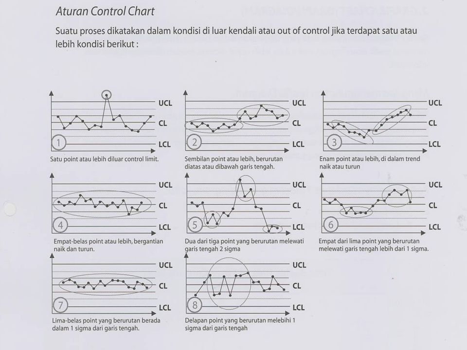
JENIS-JENIS CONTROL CHART

40
PROCESS IN CONTROL Process in Control: Titik-titik terdistribusi secara random di sekitar center line dan semua titik berada di dalam control limit

41
Formula Untuk variabel control chart (m = no. of subgroups)
– R chart s chart : centre line = centre line = UCL UCL LCL LCL R: S: centre line = centre line = UCL LCL LCL LCL

42
Formula untuk variabel control chart parameters (cont’d)
3. X-MR chart X centre line = / m UCL / = LCL / = MR: centre line = UCL = 3.267 LCL note: MR is defined as follows: = underfined =

43
TABEL KONSTANTA SUB GROUP SIZE Chart for Averages
Chart for standart Deviations Chart for ranges Factor for control limits Factor for Factor for central line control limit Factor for Factor for central line control limit A A A3 C /(C4) B B B B6 d /(d2) d D D D D4 2 3 4 5 6 7 8 9 10 11 12 13 14 15 16 17 18 19 20 21 22 23 24 25
 B3 B4 B5 B6. d2 1/(d2) d3 D1 D2 D3 D")
44
Contoh Aplikasi Grafik
Target Setting Before Vs Target Januari Februari

45
Control chart perbandingan before Vs After
Lebar garis control before = = 16.14 Lebar garis control after = = 8.99 % Improvement = ( )/16.14 = 44.3%
/16.14 = 44.3%")
46
Contoh Run Chart perbandingan

47
4. Diagram Pareto

48
DIAGRAM PARETO DEFINISI:
Diagram Pareto adalah sebuah grafik balok berbentuk vertikal yang mengurutkan hasil pengukuran dari yang tertinggi ke yang terendah Diagram Pareto merupakan salah satu bentuk Bar Chart, dimana setiap balok dapat mencerminkan suatu hasil perhitungan kategori, suatu fungsi (rumus) dari kategori (seperti rata-rata, jumlah, atau standar deviasi) atau jumlahan nilai dari suatu tabel Pada umumnya digunakan untuk menunjukkan masalah yang disusun dari prioritas tertinggi ke yang terendah untuk menentukan masalah yang harus ditangani terlebih dahulu Pertama kali ditemukan oleh Vilfredo Pareto, ahli ekonomi Italia
 dari kategori (seperti rata-rata, jumlah, atau standar deviasi) atau jumlahan nilai dari suatu tabel. Pada umumnya digunakan untuk menunjukkan masalah yang disusun dari prioritas tertinggi ke yang terendah untuk menentukan masalah yang harus ditangani terlebih dahulu. Pertama kali ditemukan oleh Vilfredo Pareto, ahli ekonomi Italia.")
49
DIAGRAM PARETO MANFAAT:
Merupakan pedoman memilih peluang perbaikan berdasarkan prinsip “Vital Few” dari “Trivial Many”. Memfokuskan sumber daya pada area/ defect/ penyebab yang menghasilkan keuntungan yang terbesar Membandingkan frekuensi dan/atau dampak dari berbagai penyebab masalah

50
DIAGRAM PARETO Defect Produksi FT 1 – Periode: 1-7 Juli 2001
Kesimpulan: Defect paling besar di FT 1 pada 1-7 Juli 2001 adalah Chipping (40 pcs = 37.38%)
")
51
Data sebelum implementasi Data setelah implementasi Week 005-006
Pareto Perbandingan Cum 100% 10 5 3 2 15 20 Data sebelum implementasi Week 1 Data setelah implementasi Week Daun me- nguning Tnm Ber - Penyakit Tnm Tumbang Tnm Kerdil Kesimpulan? Berapa persen improvemen yang dicapai?

52
Contoh proposal team dalam penentuan masalah yang harus segera diselesaikan
Team sebaiknya fokus untuk menyelesaikan ketiga complaint terbesar C, B dan A Yang mempunyai cumulative masalah sebesar 77.1%

53
Pada proyek pertama, team fokus hanya pada satu object.
Efek Synergis Pareto Memperbaiki salah satu, yang lain ikut terpengaruh Pada proyek pertama, team fokus hanya pada satu object. Hasilnya, tidak hanya satu object saja yang berpengaruh, semua ikut terpengaruh.

54
5. Histogram

55
HISTOGRAM DEFINISI: Grafik Balok yang menggambarkan penyebaran data sebagai hasil dari satu macam pengukuran, atas suatu kejadian atau proses MANFAAT: Berguna untuk menguji bentuk dan penyebaran sample data: Untuk melihat range dan distribusi dari data continuous (misalnya: berat barang yang dikirim, dollar yang dibelanjakan dalam setiap PO, dsb) Untuk melihat variasi dan tingkat pemenuhan spesifikasi/persyaratan pelanggan (size, cycle time, suhu, dsb). Hanya berlaku untuk data continuous saja
 Untuk melihat variasi dan tingkat pemenuhan spesifikasi/persyaratan pelanggan (size, cycle time, suhu, dsb). Hanya berlaku untuk data continuous saja.")
56
EXAMPLE : HISTOGRAM DATA FOR HISTOGRAM (EMPLOYEE HEIGHT - WEIGHT (KG)) CHECK SHEET FOR HISTOGRAM Number of data values = n = 100 k = sqrt (100) = 10 Range = max – min = 124 – 77 = 47 H = Range / k = 47 / 10 = 4,7
 = 10. Range = max – min = 124 – 77 = 47. H = Range / k = 47 / 10 = 4,7.")
57
HISTOGRAM CONTOH

58
HISTOGRAM STEPS Tentukan variabel data dari suatu hasil pengukuran. Misal : Waktu, Ukuran panjang, pendek lebar, Bobot, Kecepatan, Keasaman (PH). Ambil data points Siapkan tabel frekuensi data Hitung jumlah data = n Tentukan range data, max – min = r Tentukan interval/ jumlah balok, akar dari n = k Tentukan jarak tiap interval , r/k = h Bentuk tabel data berdasarkan nilai a – d Masukkan data tabel ke dalam grafik

59
HISTOGRAM STEPS Beri label di sumbu X dengan nilai dari tiap balok (dari balok pertama s/d balok ke k) Balok pertama : min + h Balok kedua : min + 2h ….. kth Bar : min + (kxh) Hitung jumlah data dari tiap balok Sumbu vertikal (Y) menunjukkan jumlah data pada tiap balok Sumbu horisontal (X) menunjukkan nilai data dari tiap balok Analisa histogram, pelajari pola distribusi datanya.
 Hitung jumlah data dari tiap balok. Sumbu vertikal (Y) menunjukkan jumlah data pada tiap balok. Sumbu horisontal (X) menunjukkan nilai data dari tiap balok. Analisa histogram, pelajari pola distribusi datanya.")
60
Latihan Histogram Buatlah histogram dengan menggunakan flipchart terhadap tinggi-berat Interpretasikan hasilnya

61
Normal Distribution (Symmetrical)
HISTOGRAM PATTERN Normal S er 5 10 15 20 25 30 35 Normal Distribution (Symmetrical) Anda bisa memberi tanda spesifikasi pelanggan pada histogram sehingga secara visual dapat diketahui seberapa baik kemampuan proses memenuhi (tidak memenuhi) persyaratan pelanggan. Anda juga dapat memunculkan nilai rata-rata dan Standard deviasi/ sigma pada histogram ini sebagai angka yang mewakili proses
 Anda bisa memberi tanda spesifikasi pelanggan pada histogram sehingga secara visual dapat diketahui seberapa baik kemampuan proses memenuhi (tidak memenuhi) persyaratan pelanggan. Anda juga dapat memunculkan nilai rata-rata dan Standard deviasi/ sigma pada histogram ini sebagai angka yang mewakili proses.")
62
Data memiliki dua puncak
HISTOGRAM PATTERN 25 30 30 20 25 25 20 20 15 15 15 10 10 10 5 5 5 Skewed Distribution Kelompok data mendekati salah satu ekor histogram Contoh: Waktu proses, cycle time, biaya Analisa kondisi apa yang terjadi di area ekor yang membedakan dengan area lainnya, jika kondisi tersebut tidak diinginkan lakukan perbaikan, eliminir kejadiannya, tetapi jika merupakan kondisi yang diinginkan maka pertahankan dan dapat diterapkan di area lain. Bimodal distribution Data memiliki dua puncak Pola ini muncul bila sesuatu yang anda perkirakan sebagai sebuah proses ternyata adalah dua proses Jika anda melakukan stratifikasi, Anda bisa mengidentifikasi sumber data dari setiap puncak Evenly distributed data values Jarang sekali terjadi Model ini muncul di pabrik bila sebuah gauge atau tools pengukuran sudah tidak lagi sensitif dalam mendeteksi perbedaan antara unit (seperti sebuah penggaris yang seluruhnya hanya memiliki tanda inci)
")
63
EXAMPLE : HISTOGRAM KASUS:
Anda bekerja di pabrik shampoo dan ingin memastikan bahwa tutup botol dikencangkan secara baik. Jika terlalu longgar, maka ada kemungkinan bocor selama pengiriman. Jika terlalu keras, maka akan sulit untuk dibuka pelanggan (terutama bila sedang mandi) Anda mengumpulkan sampel secara acak dari botol yang ada dan membuka tutup botol. Buat histogram untuk mengevalusi data dan seberapa dekat data sample terhadap nilai target 18
 Anda mengumpulkan sampel secara acak dari botol yang ada dan membuka tutup botol. Buat histogram untuk mengevalusi data dan seberapa dekat data sample terhadap nilai target 18.")
64
EXAMPLE : HISTOGRAM Interpreting the results
Sebagian tutup dikencangkan dengan kekuatan torsi 13 dan 25. Hanya ada satu tutup yang sangat longgar, dengan kekuatan kurang dari 11. nampak distribusi skewed/ miring kearah positif; yang menunjukkan beberapa tutup terlalu kencang dari yang seharusnya. Banyak tutup yang membutuhkan kekuatan lebih dari 24 untuk dibuka dan lima tutup membutuhkan kekuatan lebih dari 33, sekitar dua kali lipat dari target.

65
Contoh Histogram perbandingan
Kesimpulan?

66
6. FISHBONE DIAGRAM

67
DIAGRAM SEBAB DAN AKIBAT
DEFINISI: Suatu diagram yang terstruktur untuk mengidentifikasi penyebab dari masalah dan hubungan sebab akibat berdasarkan pengalaman dan keahlian dari sekelompok orang dengan melakukan brainstorming secara terstruktur Juga dapat dilakukan untuk brainstorming cara-cara yang perlu dilakukan untuk mencapai suatu tujuan Diagram Sebab-Akibat ini dikembangkan tahun 1943 oleh Prof Kaoru Ishikawa. Sehingga diagram ini juga sering disebut diagram Ishikawa atau diagram Tulang Ikan karena bentuknya mirip tulang ikan

68
DIAGRAM SEBAB DAN AKIBAT
MANFAAT: Mengidentifikasi sebab-sebab utama masalah Mengidentifikasi akar masalah Mengidentifikasi beberapa alternatif cara penyelesaian masalah

69
CONTOH DIAGRAM ISHIKAWA
Sebab dominan dari kebocoran di pre-heater adalah: Sering feeding stop Design tidak bagus

70
Langkah didalam meeting TQM
Pastikan semua orang memahami prosesnya dulu maka sebelum meeting/ brainstorming penyebab perlu diulas flow chart proses atau SIPOC diagram proses. Identifikasi siapa saja (Man) yang terlibat, metode, alat ukur, mesin-mesin, pengaruh lingkungan, material. Semua ide penyebab masalah ditulis Hati-hati jebakan jawaban “WHY” 80% keberhasilan project anda ditentukan oleh fase ini. Apa kemungkinan penyebab? Dan, Bagaimana membuktikannya?
 yang terlibat, metode, alat ukur, mesin-mesin, pengaruh lingkungan, material. Semua ide penyebab masalah ditulis. Hati-hati jebakan jawaban WHY 80% keberhasilan project anda ditentukan oleh fase ini. Apa kemungkinan penyebab Dan, Bagaimana membuktikannya")
71
Contoh 1

72
Contoh 2 Selected Root cause is:
Employee medications requests ( the number of employee prescription requests by telephone to the pharmacy was causing a delay in medication delivery

73
EXERCISE: CAUSE & EFFECT DIAGRAM
Identify the root cause of your identified problem from your previous analysis using Cause & effect Diagram

74
7. SCATTER DIAGRAM

75
DIAGRAM TEBAR (SCATTER DIAGRAM)
DEFINISI: Diagram yang menggambarkan hubungan (korelasi) antara dua variabel (faktor) MANFAAT: Menyajikan data untuk mengkonfirmasikan hipotesa apakah dua variabel (faktor) saling berhubungan/berkorelasi Mengetahui seberapa erat hubungan antara dua faktor tersebut Sebagai tools untuk memverifikasi akar penyebab yang diperoleh dari analisa sebab dan akibat
 antara dua variabel (faktor) MANFAAT: Menyajikan data untuk mengkonfirmasikan hipotesa apakah dua variabel (faktor) saling berhubungan/berkorelasi. Mengetahui seberapa erat hubungan antara dua faktor tersebut. Sebagai tools untuk memverifikasi akar penyebab yang diperoleh dari analisa sebab dan akibat.")
76
DIAGRAM TEBAR (SCATTER DIAGRAM)
CONTOH KORELASI: Antara jumlah kunjungan ke pelanggan dengan hasil penjualan Antara keluhan pelanggan dengan pendapatan usaha Antara lama kerja dengan prestasi kerja Antara jumlah salesman dengan dengan hasil penjualan Antara waktu pelayanan dengan kepuasan pelanggan Antara umur mesin dengan jumlah breakdown Antara jumlah sampel yang diinspeksi dengan jumlah defect Antara frekuensi perawatan dengan jumlah reject/breakdown Antara tingkat inventory dengan jumlah produk kadaluarsa Antara jumlah buku dengan kompetensi karyawan Antara jam training dengan kecelakaan/kesalahan kerja

77
JENIS KORELASI ANTARA DUA VARIABEL

78
Kesimpulan: karena nilai “r” = 0
Kesimpulan: karena nilai “r” = mendekati 1, maka bisa disimpulkan ada korelasi yang cukup kuat antara variabel X dan variabel Y (peningkatan kunjungan mempengaruhi peningkatan penjualan)
")
79
Contoh1 pemakaian dalam verivikasi akar masalah untuk menentukan penyebab yang dominan

80
Contoh2 pemakaian dalam verivikasi akar masalah untuk menentukan penyebab yang dominan

81
Contoh2 pemakaian dalam verivikasi akar masalah untuk menentukan penyebab yang dominan

82
SCATTER DIAGRAM SANGAT DIPERLUKAN DALAM
PEMBUKTIAN AKAR PENYEBAB MASALAH

83
Latihan Scatter Diagram
Tinggi Berat Badan Nomor Sepatu Nomor Celana Jeans Jumlah (Gelas) Air Diminum/ hari
 Air Diminum/ hari.")
84
Sekian Terimakasih

Presentasi serupa

. What is BPOS? Apakah BPOS itu? •BPOS = (Microsoft) Business Productivity Online Suite (Service) •adalah sebuah layanan online Microsoft,>")


>")


