Upload presentasi
Presentasi sedang didownload. Silahkan tunggu

1
Dasar Desain Interaksi

2
Dasar Desain Interaksi
apa itu, intervensi, tujuan, kendala Proses Desain apa yang terjadi ketika Pengguna siapa mereka, apa yang mereka menyukai ... Skenario kaya cerita desain Navigasi menemukan jalan sekitar Anda sistem Iterasi dan Prototipe tidak pernah benar pertama kalinya!

3
Apa Itu Desain ? mencapai tujuan dalam keterbatasan Tujuan – Maksud
Untuk siapa?, mengapa mereka menginginkannya Kendala bahan, platform Hasil bernilai jual

4
Aturan Desain Umumnya : Pada IMK : Pahami material yang ada
Pahami komputernya : Kemampuan, tools, kapasitas, platforms Pahami pengguna : Psikologi, sosial, kesalahan manusia pada sistem Dan dari interaksi user terhadap sistem

5
Kesalahan Manusia laporan kecelakaan ..
aircrash, kecelakaan industri, kesalahan rumah sakit Pertanyaannya, mau menyalahkan manusia? tetapi … tiang beton retak karena terlalu banyak beban berat menyalahkan tiangnya? Tidak…tetapi…. kesalahan desain kita tahu bagaimana berperilaku beton di bawah tekanan manusia salah adalah normal kita tahu bagaimana pengguna berperilaku di bawah tekanan sehingga desain untuk itu! memperlakukan pengguna setidaknya dari bentuk fisik!

6
Fokus Dari Sistem the user

7
Siklus Hidup Software Dengan Model Air Terjun

8
Waterfall Model

9
Kekurangan Dari Model Ini Adalah
Adanya kesulitan dalam mengakomodasi perubahan setelah proses dijalani. Fase sebelumnya harus sudah lengkap dan selesai dikerjakan sebelum ke fase berikutnya.

10
Masalah Dalam Waterfall
Perubahan sulit dilakukan karena sifatnya kaku : Cocok untuk kebutuhan yang dikumpulkan secara lengkap. Perubahan ditekan sekecil mungkin. Umumnya digunakan untuk rekayasa sistem yang besar dimana proyek di kerjakan di beberapa tempat.

11
Proses Desain scenarios task analysis what is wanted guidelines
interviews ethnography what is there vs. what is wanted guidelines principles dialogue notations precise specification architectures documentation help evaluation heuristics scenarios task analysis what is wanted analysis design implement and deploy precise=tepat ethnography=gambaran bangsa2 prototype

12
Langkah-langkah Kebutuhan Analisa Desain Iterasi dan prototyping
apa yang ada dan apa yang diinginkan ... Analisa pemesanan dan pemahaman Desain apa yang harus dilakukan dan bagaimana untuk memutuskan Iterasi dan prototyping mendapatkan sesuatu dengan benar ... dan menemukan apa yang benar-benar dibutuhkan! Implementasi dan penyebaran membuat dan mendapatkan hal itu di luar sana

13
… bagaimana bisa dilakukan semuanya ! !
Terbatasnya waktu design trade-off Kegunaan? Menemukan masalah dan memperbaikinya? Memutuskan apa yang harus diperbaiki? System yang sempurna yang di desain buruk Terlalu baik terlalu banyak upaya dalam desain trade-off=menjual trade-offs=tarik menarik effort=usaha

14
Fokus ke User Ketahui siapa pemakainya Persona (karakter)
Cari tahu kebiasaan/budayanya

15
Ketahui Siapa Pemakainya
siapa mereka? mungkin dia tidak seperti Anda! berbicara dengan mereka mengawasi mereka menggunakan imajinasi Anda

16
Persona Menjelaskan contoh user Digunakan sebagai pengganti user
Tidak diperlukan user yang nyata Digunakan sebagai pengganti user Apa yang dipikirkan Joni Rincian masalah Dibuat se-nyata mungkin

17
Cari tahu Kebiasaan/Budayanya
pengamatan langsung di rumah psikiatri pasien paket probe item ke prompt tanggapan umpamanya kaca untuk mendengarkan pada dinding, kamera, kartu pos diberikan kepada orang-orang untuk terbuka di lingkungan mereka sendiri, mereka merekam apa yang bermakna bagi mereka digunakan untuk menginformasikan wawancara, ide-ide prompt, desainer enculture

18
struktur lokal - layar tunggal struktur global - keseluruhan situs
the systems info and help management messages add user remove user start navigation design struktur lokal - layar tunggal struktur global - keseluruhan situs whole=keseluruhan site=tempat main screen remove user confirm add user

19
levels widget choice screen design application navigation design
menus, buttons etc. screen design application navigation design environment other apps, O/S widget=liar=susah=tak teratur environment=lingkungan

20
the web … widget choice screen design navigation design environment
elements and tags <a href=“...”> page design site structure the web, browser, external links

21
physical devices controls physical layout modes of device
buttons, knobs, dials physical layout modes of device the real world widget choice screen design navigation design environment

22
think about structure within a screen local global wider still
later ... local looking from this screen out global structure of site, movement between screens wider still relationship with other applications wider=jangkauan,lbh luas

23
from one screen looking out
local from one screen looking out

24
goal seeking goal start

25
goal seeking goal start progress with local knowledge only ...

26
goal seeking goal start … but can get to the goal

27
goal seeking goal start … try to avoid these bits! avoid=menghindari
bits=titik,keruwetan … try to avoid these bits!

28
four golden rules knowing where you are knowing what you can do
knowing where you are going or what will happen knowing where you’ve been or what you’ve done

29
where you are – breadcrumbs
shows path through web site hierarchy top level category sub-category web site this page live links to higher levels

30
beware the big button trap
things the thing from outer space more things other things where do they go? lots of room for extra text!

31
modes lock to prevent accidental use … if lock forgotten
remove lock - ‘c’ + ‘yes’ to confirm frequent practiced action if lock forgotten in pocket ‘yes’ gets pressed goes to phone book in phone book … ‘c’ – delete entry ‘yes’ – confirm … oops !

32
between screens within the application
global between screens within the application

33
hierarchical diagrams
the system info and help management messages add user remove user

34
hierarchical diagrams ctd.
parts of application screens or groups of screens typically functional separation the systems info and help management messages add user remove user

35
navigating hierarchies
deep is difficult! misuse of Miller’s 7 ± 2 short term memory, not menu size optimal? many items on each screen but structured within screen see /e3/online/menu-breadth/

36
what does it mean in UI design?
think about dialogue what does it mean in UI design? Minister: do you name take this woman … Man: I do Minister: do you name take this man … Woman: I do Minister: I now pronounce you man and wife

37
what does it mean in UI design?
think about dialogue what does it mean in UI design? marriage service general flow, generic – blanks for names pattern of interaction between people computer dialogue pattern of interaction between users and system but details differ each time Minister: do you name take this woman …

38
network diagrams show different paths through system main screen
remove user confirm add user show different paths through system

39
network diagrams ctd. what leads to what what happens when
including branches more task oriented then hierarchy main screen remove user confirm add user

40
between applications and beyond ...
wider still between applications and beyond ...

41
wider still … style issues: functional issues navigation issues
platform standards, consistency functional issues cut and paste navigation issues embedded applications links to other apps … the web

43
screen design and layout
Dix , Alan Finlay, Janet Abowd, Gregory Beale, Russell screen design and layout basic principles grouping, structure, order alignment use of white space ABCDEFGHIJKLM NOPQRSTUVWXYZ

44
basic principles ask think design what is the user doing?
what information, comparisons, order design form follows function

45
available tools grouping of items order of items
decoration - fonts, boxes etc. alignment of items white space between items

46
grouping and structure
logically together physically together Billing details: Name Address: … Credit card no Delivery details: Delivery time Order details: item quantity cost/item cost size 10 screws (boxes) …… … … …
 …… … … …")
47
order of groups and items
think! - what is natural order should match screen order! use boxes, space etc. set up tabbing right! instructions beware the cake recipie syndrome! … mix milk and flour, add the fruit after beating them

48
decoration use boxes to group logical items
use fonts for emphasis, headings but not too many!! ABCDEFGHIJKLM NOPQRSTUVWXYZ

49
alignment - text you read from left to right (English and European)
align left hand side boring but readable! Willy Wonka and the Chocolate Factory Winston Churchill - A Biography Wizard of Oz Xena - Warrior Princess Willy Wonka and the Chocolate Factory Winston Churchill - A Biography Wizard of Oz Xena - Warrior Princess fine for special effects but hard to scan

50
alignment - names Usually scanning for surnames make it easy!
Alan Dix Janet Finlay Gregory Abowd Russell Beale Dix , Alan Finlay, Janet Abowd, Gregory Beale, Russell Alan Dix Janet Finlay Gregory Abowd Russell Beale

51
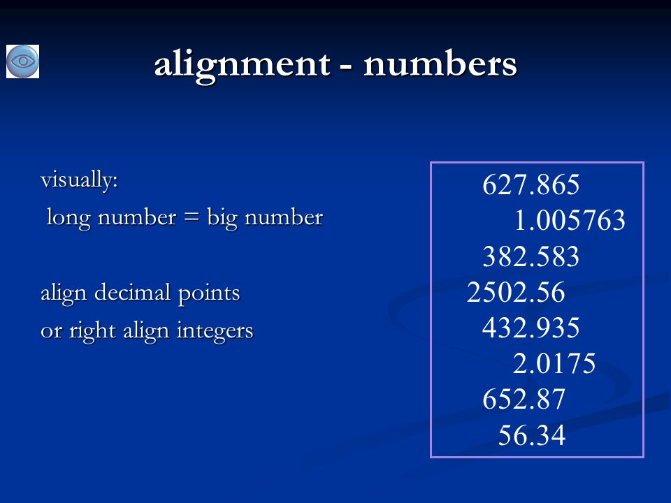
alignment - numbers think purpose!
which is biggest?

52
alignment - numbers visually: long number = big number align decimal points or right align integers
53
multiple columns scanning across gaps hard: (often hard to avoid with large data base fields) sherbert 75 toffee 120 chocolate 35 fruit gums 27 coconut dreams 85

54
multiple columns - 2 use leaders
sherbert 75 toffee 120 chocolate 35 fruit gums 27 coconut dreams 85

55
multiple columns - 3 or greying (vertical too)
sherbert 75 toffee 120 chocolate 35 fruit gums 27 coconut dreams 85

56
multiple columns - 4 or even (with care!) ‘bad’ alignment
sherbert 75 toffee 120 chocolate 35 fruit gums 27 coconut dreams 85

57
white space - the counter
WHAT YOU SEE

58
white space - the counter
WHAT YOU SEE THE GAPS BETWEEN

59
space to separate (pemisahan)
")
60
space to structure

61
space to highlight (menyorot)
")
62
physical controls grouping of items defrost settings type of food
time to cook defrost settings type of food time to cook

63
physical controls grouping of items order of items type of heating
temperature time to cook start 1 1) type of heating 2 2) temperature 3 3) time to cook 4 4) start
 type of heating. 2. 2) temperature. 3. 3) time to cook. 4. 4) start.")
64
physical controls grouping of items order of items decoration
different colours for different functions lines around related buttons different colours for different functions lines around related buttons (temp up/down)
")
65
physical controls grouping of items order of items decoration
alignment centered text in buttons ? easy to scan ? centred text in buttons ? easy to scan ?

66
physical controls grouping of items order of items decoration (hiasan)
alignment white space gaps to aid grouping gaps to aid grouping

68
tindakan pengguna dan kontrol pengguna
memasukkan informasi tahu apa yang harus dilakukan affordances (kemampuan)
")
69
? memasukkan informasi forms, dialogue boxes Layout yang Logis
Name: Address: Alan Dix Lancaster forms, dialogue boxes presentation + data input masalah tata letak yang sama alignment - N.B. different label lengths Layout yang Logis Menggunakan analisis tugas Pengelompokan natural order for entering information top-bottom, left-right (depending on culture) set tab order for keyboard entry Name: Address: Alan Dix Lancaster ? Name: Address: Alan Dix Lancaster N.B. see extra slides for widget choice
 set tab order for keyboard entry. Name: Address: Alan Dix. Lancaster. Name: Address: Alan Dix. Lancaster. N.B. see extra slides for widget choice.")
70
knowing what to do apa yang aktif apa pasif gaya konsisten membantu
mana Anda mengklik mana Anda mengetik gaya konsisten membantu umpamanya digarisbawahi web link label dan ikon tindakan standar untuk umum bahasa - tebal = arus atau tindakan

71
Kemampuan (affordances)
mug handle psychological term Untuk obyek fisik shape and size suggest actions pick up, twist, throw also cultural – buttons ‘afford’ pushing Untuk obyek layar button–like object ‘affords’ mouse click physical-like objects suggest use culture of computer use icons ‘afford’ clicking or even double clicking … not like real buttons! ‘affords’ grasping (genggaman)
")
72
sesuai tampilan presenting information aesthetics and utility
colour and 3D localisation & internationalisation

73
menyajikan informasi purpose matters but add interactivity
sort urutan (yang kolom, abjad numerik) text vs. diagram menyebarkan grafik vs. histogram prinsip-prinsip presentasi kertas digunakan! but add interactivity softens design choices e.g. re-ordering columns ‘dancing histograms’ (chap 21) chap10 chap5 chap1 chap14 chap20 chap8 … 12 16 17 22 27 32 name size chap1 chap10 chap11 chap12 chap13 chap14 … 17 12 51 262 83 22 size name size
 text vs. diagram. menyebarkan grafik vs. histogram. prinsip-prinsip presentasi kertas digunakan! but add interactivity. softens design choices. e.g. re-ordering columns. ‘dancing histograms’ (chap 21) chap10. chap5. chap1. chap14. chap20. chap8. … name. size. chap1. chap10. chap11. chap12. chap13. chap14. … size. name. size.")
74
estetika dan utilitas desain estetika
meningkatkan kepuasan pengguna dan meningkatkan produktivitas keindahan dan utilitas mungkin bertentangan gaya visual terlibat mudah untuk membedakan desain yang bersih– sedikit perbedaan membingungkan latar belakang di balik teks … baik untuk melihat, tapi sulit untuk membaca tetapi dapat bekerja sama misalnya desain meja dalam produk konsumen– pembeda utama (misalnya iMac)
")
75
colour and 3D keduanya sering digunakan dengan sangat buruk! Warna
monitor yang lebih tua terbatas palet berhati-hatilah buta warna! gunakan hemat untuk memperkuat informasi lainnya Efek 3D baik untuk informasi fisik dan beberapa grafik

76
bad use of colour over use - without very good reason (e.g. kids’ site) colour blindness poor use of contrast do adjust your set! adjust your monitor to greys only can you still read your screen?

77
di seluruh negara dan budaya
lokalisasi & internasionalisasi mengubah antarmuka untuk budaya tertentu / bahasa globalisasi mencoba untuk memilih dll simbol-simbol yang bekerja di mana-mana hanya mengubah bahasa? menggunakan sumber database bukan teks literal… tapi ukuran perubahan, urutan kiri-kanan dll lebih dalam isu-isu asumsi dan nilai-nilai budaya makna simbol

79
prototyping

80
iteration and prototyping
getting better … … and starting well

81
prototyping anda tidak pernah mendapatkan benar pertama kali
jika pada awalnya Anda tidak berhasil ... prototype evaluate design re-design done! OK?

82
Perangkap prototyping
bergerak sedikit demi sedikit ... tapi ke mana? Malverns or the Matterhorn? 1. membutuhkan titik awal yang baik 2. perlu memahami apa yang salah

Presentasi serupa


 Pepri(2012002096) Rizky(2012002077)>")


 is a very powerful objectoriented.>")